
Vantage Property Management
Brand Identity • Marketing Materials
The Challenge
Update the company’s brand image to appeal to new and experienced residential real estate investors.
Vantage is a residential property management firm whose target audience is high-value, educated clients. To resonate with new and existing clients, the brand needed an integrated design that communicated professionalism and excellent service.
The Solution
A unified brand update that positions the company in a higher class of business while appealing to their target audience in a warm and engaging way.
In working with all of the brand components at once, it was possible to elevate their level of professionalism and assure clients that they could be trusted with high-stakes real estate business.
The brand update reflects the company’s values: helping clients maximize ROIs and delivering peace of mind with a professional, experienced, and personal touch.
Research & Strategy
+ Competitors
+ Target Audience
Creative
+ Logo Design
+ Color System
+ Stationery
+ Sales Sheets
+ Signage
+ Marketing Materials

Competitors
-

During the Research and Discovery Phase of the project, it became clear that Vantage Property Management needed to differentiate itself from competitors who used similar commonplace themes.
-

To ensure the logo's effectiveness, specific guidelines were established. First, it was necessary to emphasize "vantage" in the brand's design. The logo should have a modern, classic, and professional appearance to establish trust and expertise with potential clients. To avoid appearing generic or unoriginal, it was wise to avoid cliché real estate symbols such as houses, roofs, and windows. Furthermore, reds, greens, and blues would be avoided due to their association with other companies.

Target Audience
-

Property Owners
Percentages above are taken from Vantage’s service area.
-
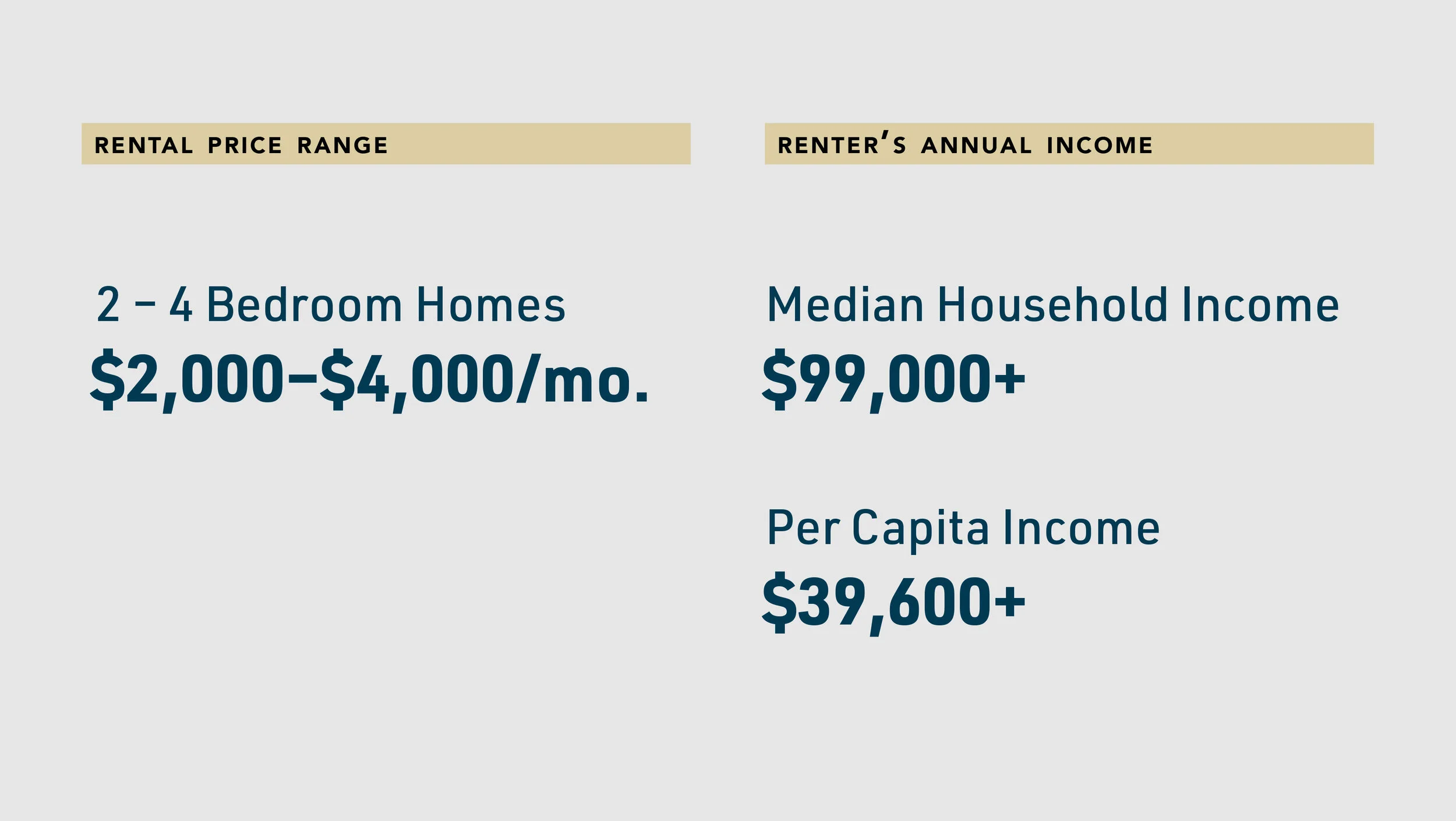
Renters
Most often, rental applicants are young families looking for a suburban home in an areas with a good school system with safe neighborhood.

Logo
New Logo
To make "Vantage" a first impression, we reorganized, simplified, and modernized the font choices. We saw an opportunity in the letter V to add a small unique detail familiar to users of online maps - a pinpoint. This visual cue nods to real estate owners subtly and sophisticatedly.
Old Logo
Vantage’s original logo did not appeal to its target audience. The stencil-like letter forms gave the business an industrial quality that suited a commercial construction company better.

Colors
-

Mellow & Trombone Yellows: Prestige & Trust
We drew inspiration from the plochere color system frequently utilized in interior design to create Vantage's color palette and opted for golden-yellow shades to add mature and grounded optimism to the brand. Flashy golds were avoided to maintain a professional and experienced image. By incorporating warm and trustworthy colors, we conveyed the brand's dedication to providing quality customer service and care for clients' investments
-

Rich Dark Teal: Wisdom & Balance.
The old blue and green colors were combined into one. This updated color scheme reflects the brand's commitment to clarity of thought and trustworthiness in business. Additionally, using a dark teal brings to mind jade's qualities - wisdom, experience, and protection - which further enhances the brand's image as a reliable and trustworthy provider of services.


Marketing Materials


Model & Lifestyle Images


