729 Beauty
Brand Identity • Package Design • Style Guide
The Challenge
729 Beauty, a funded start-up in the haircare industry, needed a visual identity that captured the empowering, bold, and uniquely formulated products created by its founders in Los Angeles.
The Audience
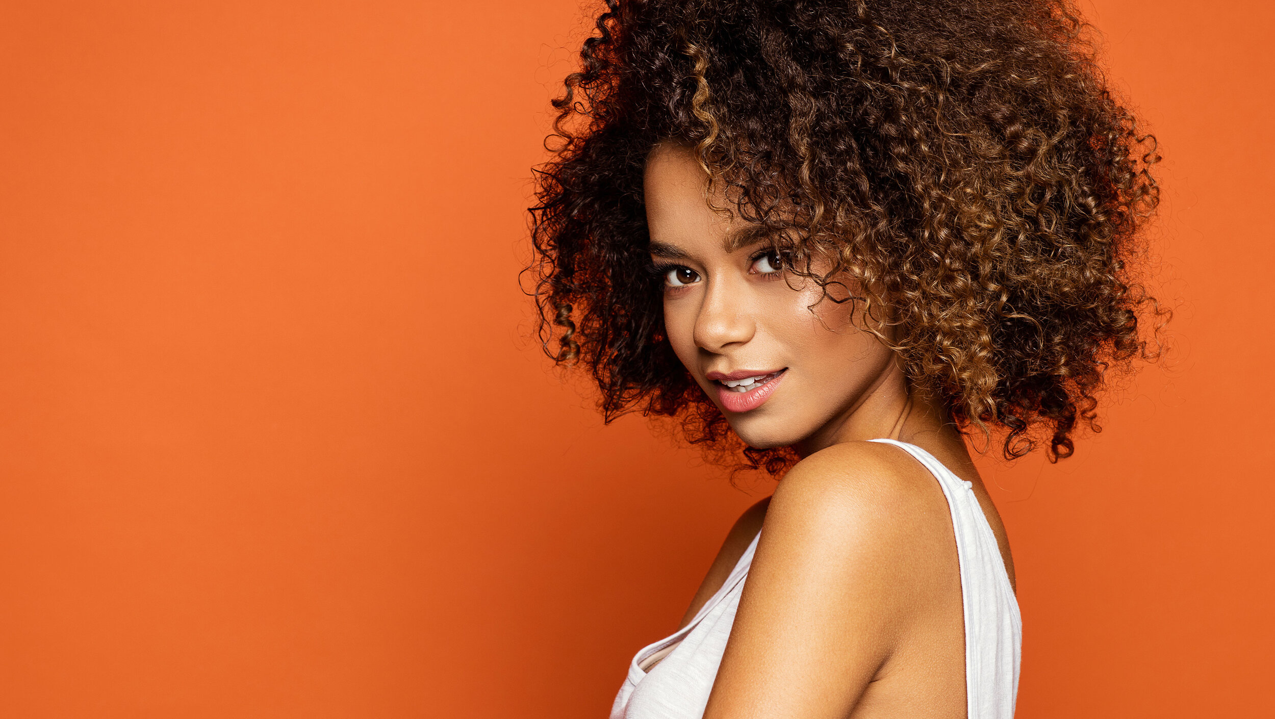
A diversity of women, 20–48 years old who have textured non-straight hair, plus hairstylists and salon owners.
The Solution
A captivating, visually rich, and highly symbolic brand identity.
Research & Strategy
+ Competitor Audit
Creative
+ Logo Design
+ Color System
+ Style Guide
+ Package Design
+ Pattern Design
+ Business Card Design

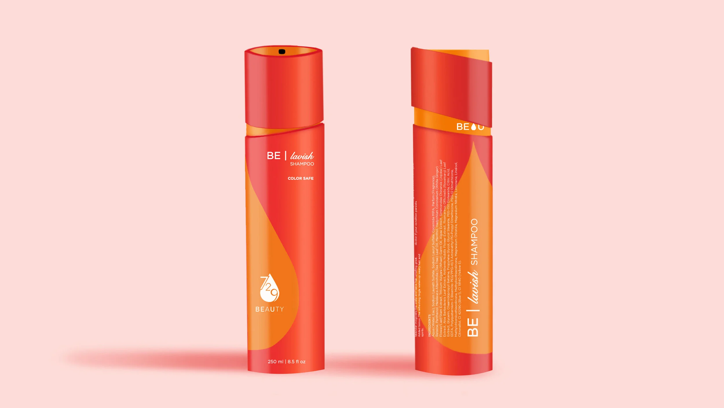
Colors
-

Blood Orange: Fiery & Empowering
Orange radiates warmth and happiness, combining the energetic, stimulating effects of red with the cheerfulness of yellow. In color psychology orange is optimistic, uplifting, rejuvenating.
Orange aids in the assimilation of new ideas and promotes creative thinking, enhancing one’s freedom to be themself. At the same time it encourages self-respect and respect for others.
A provocative attention-getter, Blood Orange is especially appealing to consumers in women’s fashion and beauty due to its skin complementing hue.
-

Purple: Power & Bravery
Purple is a combination of red and blue and takes on attributes of both colors including creativity and imagination. Dark purples are traditionally associated with wealth, royalty, and luxury.
This deep shade of vibrant açaí purple adds mystery and richness to 729 Beauty’s palette, creating a powerful combination with blood orange that is both feminine, modern, and bold.

Logo & Patterns
-

Meaning
729 Beauty’s logo acknowledges three different textures of hair with tailored numerals 7, 2 and 9. Each representing straight, wavy, and curly hair respectively. Each type of texture presents with its own merits and challenges.
729 Beauty’s products promote hydration as the unifying method of care for all hair types. Thus, the water drop was incorporated into the logo design to visual cue in consumers to 729 Beauty’s ultra-hydrating formulas.
-

BE U
Part of the company’s mission is to promote women to embrace natural, expressive, and healthy hairstyles. The founders encourage all their clients, young and mature, to feel confident in their own self-expression.
In this case, we were lucky that the letters B E U were part of the company’s name. We added a subtle bold-weight to them.
Overall, 729 Beauty’s logo successfully captures multiple levels of meaning: (1) 3 hair textures, (2) hydrating formula, and (3) self-expression.
-

Texture Through Patterns
The water droplet was used to create many custom graphic patterns, each symbolic of either hydration or different hair patterns.
-

-

Usage Guidelines
Style guidelines were then created to inform and direct partners, vendors, marketers, and designers on proper logo, color, and pattern combinations and uses for the company.
-


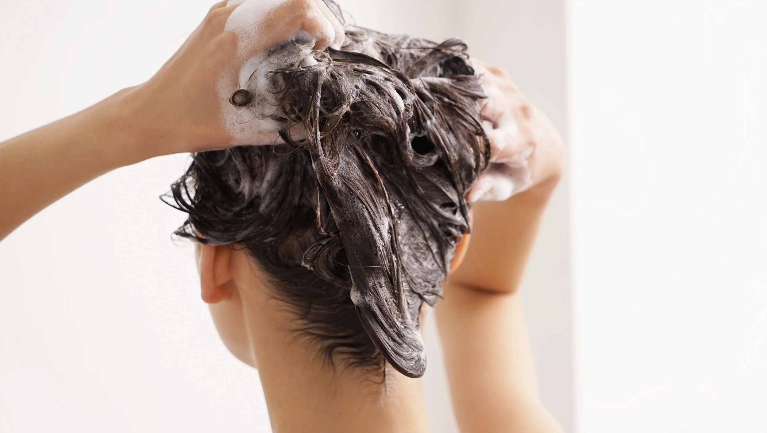
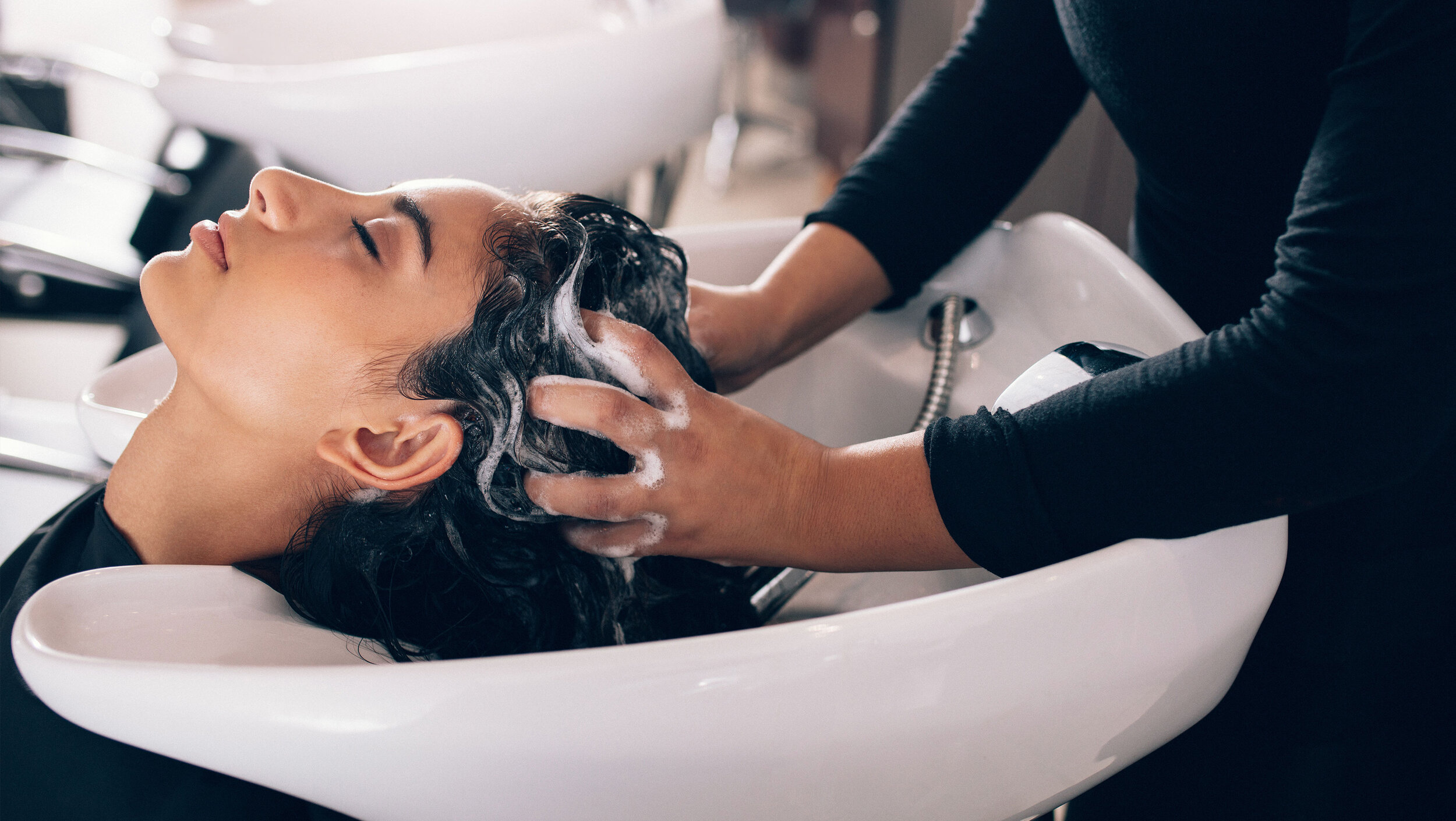
Models & Lifestyle Photos


Acknowledgments & Credits: Logo concept by Marilyn Prado-Test. Auxiliary design work provided by Olivia Paden.