Miravac
Packaging Design
The Challenge
Bring a new brand to life through clean, modern packaging that stands out next to known competitors.
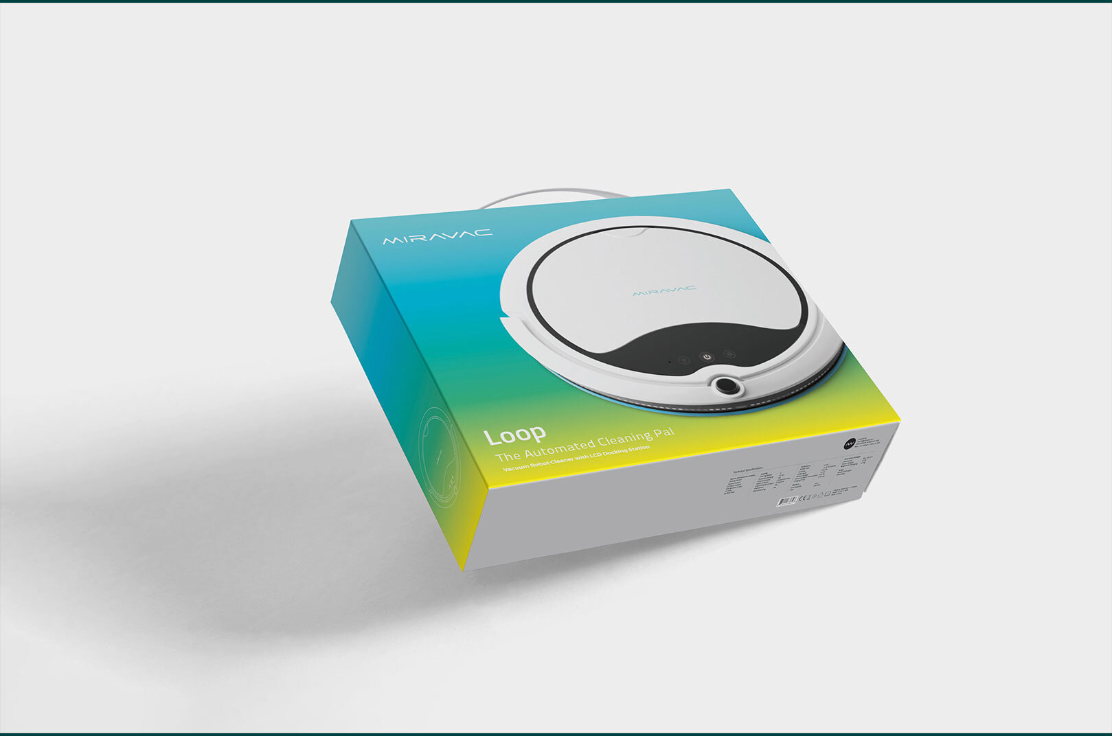
Miravac offers customers a high-quality value-driven alternative to self-vacuuming robots. The brand needed to stand out next to known and often more expensive counterparts, which required a design that communicated technological quality as well as ease of use. The real challenge in this design was to assure customers that a high-end gadget doesn’t have to be a luxury – it can be an easily accessible tool for every household.
The Solution
Eye-catching, modern design that brought the brand from KickStarter to the store.
Fresh colors and clean lines put this new product soundly ahead of its competitors, online and in person. First impressions are king for new products, especially ones marketing against customers’ expectations. Buyers are used to seeing similar products at a higher price point. The design conveyed high-end technology, instantly making Miravac a contender with its counterparts, despite the product’s newness in the market.
Research & Strategy
+ Competitors
+ Target Audience
Creative
+ Packaging Designs
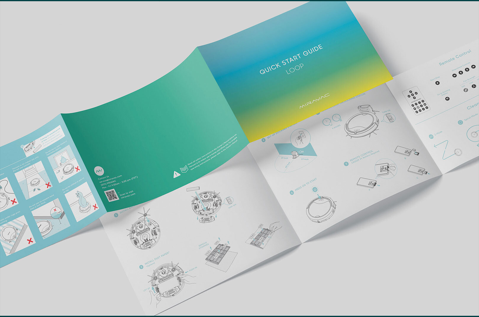
+ User Manual Designs
+ Iconography


Icons
In the process of designing the packaging, fun and informative icons were also created to pair with product features, settings, and capabilities.

Acknowledgments & Credits: Product photography by Ethan Lin. Icon animation by Seth. Logo design by Eric Sin. Project completed in partnership with R.C. Inc.


